
Most paranormal investigators record hours of audio hoping to capture EVPs and unexplained sounds. But playing back those recordings and straining your ears isn’t always enough. The Audacity spectrogram view gives you a visual representation of audio frequencies over time, turning faint or hidden sounds into something you can actually see, and that’s a serious advantage when you’re reviewing evidence from an investigation.
At Haunt Gears, we spend a lot of time testing and recommending EVP recorders, spirit boxes, and other audio capture tools. Getting good equipment matters, but knowing how to analyze what you’ve recorded matters just as much. Audacity is free, widely used, and surprisingly powerful once you know your way around it.
This guide walks you through how to enable the spectrogram view in Audacity, adjust its settings for different use cases, and put it to work identifying clicks, noise, and frequency anomalies in your audio files. Whether you’re cleaning up a recording from last weekend’s investigation or just learning the ropes, you’ll have a clear, step-by-step process to follow.
What spectrogram view shows and when to use it
Audacity’s waveform display shows you amplitude over time, which is useful for general editing. But when you need to understand what frequencies are present at any given moment, the waveform falls short. The audacity spectrogram view replaces that amplitude-based display with a color-coded frequency map, giving you a completely different perspective on your audio.
How frequency, time, and amplitude appear on screen
The spectrogram plots three pieces of information simultaneously: time runs left to right along the horizontal axis, frequency runs bottom to top along the vertical axis, and amplitude shows up as color brightness. Quieter frequencies appear darker, while louder ones show as brighter or warmer colors depending on the color scheme you select.
The spectrogram turns invisible frequency detail into something you can directly inspect, which makes it far more useful than waveform view alone for identifying anomalies.
By default, Audacity displays a frequency range from 0 Hz up to your track’s Nyquist frequency, which is half the sample rate. A 44.1 kHz recording shows frequencies up to 22.05 kHz. You’ll typically see the bulk of activity concentrated in the lower portion of the display, with mid and high frequencies spread above it.
Here’s a quick reference for what different visual patterns mean:
| What you see | What it means |
|---|---|
| Bright horizontal band | Strong, consistent tone at a specific frequency |
| Short vertical spike | A click or transient noise event |
| Smeared, scattered color | Broadband noise like hiss or room noise |
| Diagonal streak | A frequency sweep or changing pitch |
| Isolated bright dot | Brief tonal anomaly worth a closer look |
When spectrogram view gives you an edge
Waveform view handles cutting silences, adjusting levels, and basic editing just fine. But several tasks become significantly easier once you switch to the spectrogram. The most practical case is locating clicks and pops: they appear as sharp vertical lines that are easy to spot even in a busy recording, whereas on the waveform they can blend in with the surrounding signal.
For paranormal investigators, the spectrogram is a genuine tool for EVP analysis. Voices and tonal sounds occupy specific frequency bands, so if something appears that shouldn’t be there based on the environment, it shows up as a distinct mark at an unexpected range. You can visually separate it from ambient noise and focus your editing work exactly where it matters.
Noise removal is another area where the spectrogram earns its place. Before applying any noise reduction filter, looking at the spectrogram tells you exactly which frequency bands are affected by background hum, HVAC noise, or electronic interference. That lets you apply targeted treatment rather than degrading the whole recording.
Finally, if you’re reviewing audio from a spirit box or full-spectrum recorder, the spectrogram helps you rule out mundane explanations for unusual sounds. A consistent 60 Hz line almost always indicates electrical interference. A brief broadband burst might be handling noise. Seeing the shape of a sound in the spectrogram speeds up that classification process considerably.
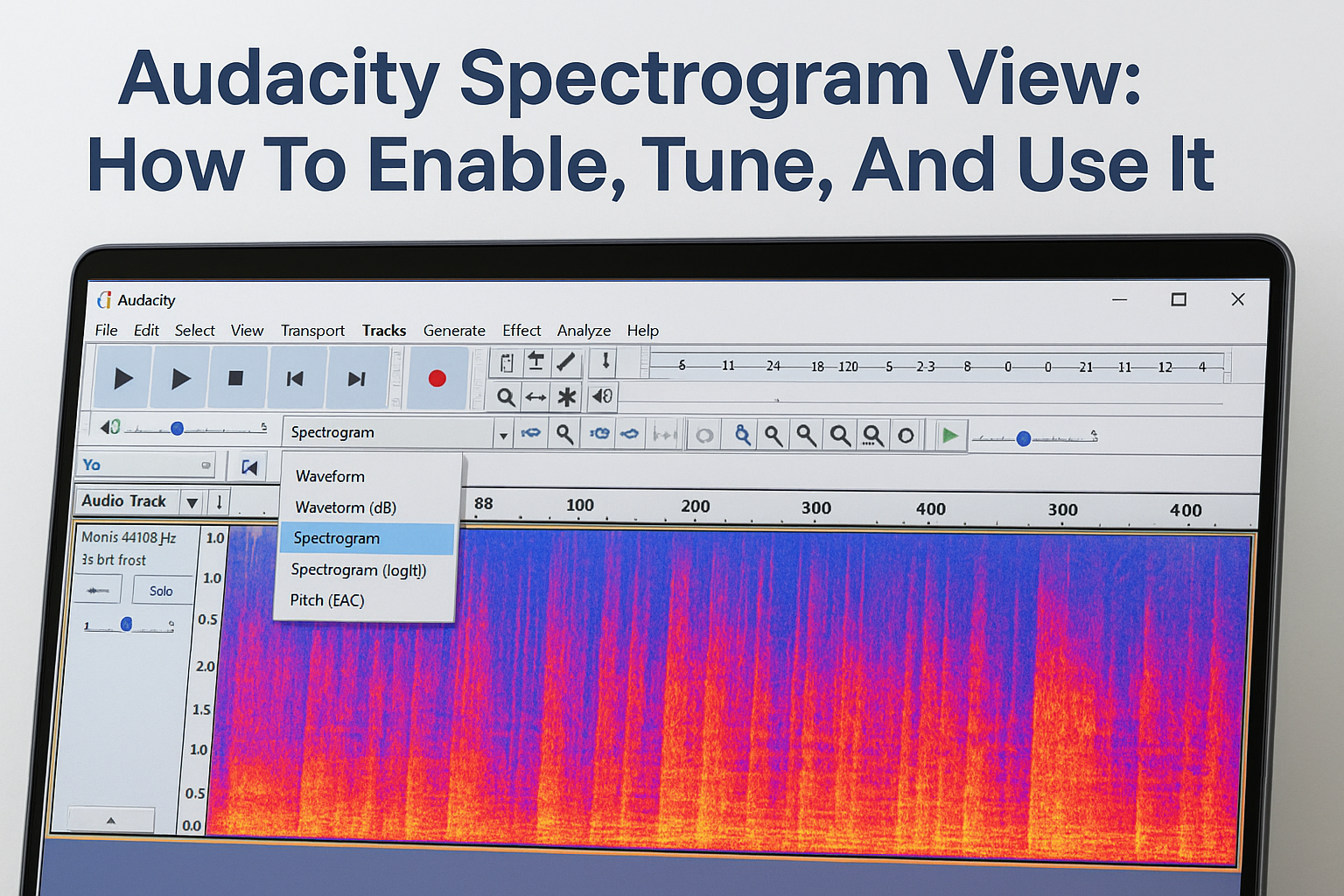
Step 1. Turn on spectrogram view
Switching to the spectrogram in Audacity takes about three clicks, and you don’t need to install anything extra. The option lives inside each individual track’s view menu, which means you can switch one track to spectrogram view while keeping another in waveform view if you need to compare them side by side.
Finding the track view menu
The view menu isn’t in the top menu bar. Instead, it sits inside the track header panel on the left side of each track. Look for the small downward-pointing arrow or the track name itself, which acts as a dropdown trigger. Here’s the exact sequence to follow:

- Open your audio file in Audacity.
- Look at the left panel of your track where the track name appears.
- Click the dropdown arrow next to the track name.
- In the menu that appears, hover over “Spectrogram” (not “Spectrogram log(f)”).
- Click it. The track display will immediately switch from the waveform to a color-coded frequency map.
If you don’t see the spectrogram option in the menu, make sure your Audacity installation is up to date, as older versions may label or organize the view options differently.
You can also access this same view by going to View > Track View in some versions of Audacity, though clicking the track name dropdown is faster and more direct.
Checking that the view loaded correctly
Once you select the spectrogram, your waveform disappears and gets replaced by a gradient display where color intensity represents amplitude at each frequency. If the display looks entirely dark or blank, the issue is almost always a very low-level recording where the default color scale makes quiet signals nearly invisible. You’ll fix that in the next step when you adjust the settings.
Your track should now show a vertical frequency axis on the left side labeled in Hz or kHz, and the time axis remains unchanged along the bottom ruler. If both axes are visible and the display shows some color variation, the audacity spectrogram view is working correctly and you’re ready to tune it.
Step 2. Tune spectrogram settings for your audio
The default spectrogram settings work as a starting point, but they’re rarely ideal for detailed audio work. Opening the Spectrogram Settings panel lets you control exactly what frequency range you’re looking at, how sensitive the display is to quiet signals, and how the color scale maps to amplitude. Getting these right makes a significant difference in what you can actually see.
To open the settings, click the track name dropdown again and select “Spectrogram Settings” at the bottom of the menu. A dialog box opens with several parameters you can adjust independently.
Adjusting scale and frequency range
The Scale setting controls how the frequency axis distributes its range. Linear scale spaces frequencies evenly from bottom to top, while logarithmic scale (log(f)) compresses the upper frequencies and expands the lower ones. For paranormal audio work, logarithmic scale is usually better because human voices and most EVP content live in the 200 Hz to 4,000 Hz range, and log scale gives that band more visual space.
Switching to logarithmic scale is often the single most useful adjustment you can make if you’re specifically analyzing voice-range audio.
You can also set a Minimum Frequency and Maximum Frequency to narrow the display to just the range you care about. For general EVP analysis, try these starting values:
| Parameter | General audio | EVP / voice focus |
|---|---|---|
| Scale | Linear | Logarithmic |
| Min Frequency | 0 Hz | 100 Hz |
| Max Frequency | 8,000 Hz | 6,000 Hz |
| Gain | 20 dB | 30 dB |
| Range | 80 dB | 60 dB |
Setting gain and range for visibility
Gain boosts the brightness of quieter signals so they become visible on screen. If your recording was captured at a low level, raising the gain to 30 dB or higher pulls faint signals out of the dark background. Range controls the overall contrast window; a smaller Range value makes differences between signal levels more distinct, while a larger value compresses them.
Adjust both parameters together. Start by raising Gain until signals appear, then tighten Range until the detail you’re looking for becomes clear without the display washing out into a single color. Click “OK” and the audacity spectrogram view updates immediately so you can evaluate the result.
Step 3. Make spectral selections and clean noise
Once your spectrogram is tuned, you can do something that waveform view simply doesn’t allow: select a specific frequency range within a time segment and apply edits only to those frequencies. This is called a spectral selection, and it’s the feature that makes the audacity spectrogram view genuinely powerful for targeted noise removal.
How to draw a spectral selection
Spectral selections work similarly to regular time-based selections, but you add a vertical dimension that locks your edit to a defined frequency band. Before you can draw one, you need to confirm that Spectral Selection is enabled in your Audacity preferences under Edit > Preferences > Tracks.

With that enabled, click and drag directly on the spectrogram track. As you drag, you’ll notice the selection has both a left-right boundary (time range) and a top-bottom boundary (frequency range). You can see the exact frequency limits displayed in the Selection Toolbar at the bottom of the screen.
Precision matters here: dragging too wide a frequency range will catch signals you don’t want to affect, so zoom in on the spectrogram first to isolate the problem area clearly.
To refine the selection after drawing it, hover over the top or bottom edge of the selection until the cursor changes to a resize arrow, then drag to adjust the frequency boundary. You can also hold Shift and click to extend or narrow the selection without starting over.
Applying noise reduction to the selected range
With a spectral selection drawn around the noise you want to remove, follow these steps to apply targeted treatment:
- Go to Effect > Noise Reduction in the top menu.
- Click “Get Noise Profile” if you’ve pre-selected a section of pure noise, or proceed directly to step 3 if you’re working from an existing profile.
- Reselect your target spectral area on the spectrogram.
- Return to Effect > Noise Reduction and set your reduction amount, sensitivity, and frequency smoothing.
- Click OK to apply the reduction only within your selected frequency band and time range.
For most EVP recordings, a Noise Reduction value between 12 dB and 18 dB removes interference without degrading the signal you’re trying to preserve. Start conservative, listen back, and apply a second pass only if the first didn’t fully clear the problem area.
Step 4. Use Plot Spectrum to confirm frequencies
The spectrogram gives you a strong visual read on what’s happening in your audio, but it’s still a representation based on color and scale settings you control. Plot Spectrum gives you a second, independent view of the same data as a precise frequency graph, and using both together lets you confirm exactly what frequencies are present before you make any permanent edits. This step is especially useful after spectral noise reduction, when you want to verify that a specific frequency band was actually cleared.
Treating Plot Spectrum as a confirmation tool, not a replacement for the spectrogram, keeps your workflow grounded in what the data actually shows rather than what it appears to show.
How to open and run Plot Spectrum
To run the analysis, you first need to select a section of your audio on the track. Selecting 3 to 10 seconds of audio gives Plot Spectrum enough data to produce a meaningful frequency curve without making the graph difficult to read. Once your time selection is set, follow these steps:
- Go to Analyze > Plot Spectrum in the top menu bar.
- A new window opens showing a frequency vs. amplitude curve for your selected audio.
- Set the Size parameter to 2048 or 4096 for better frequency resolution.
- Set Function to Hann window for general use, which balances frequency resolution with time accuracy.
- Hover your cursor over any point on the curve to read the exact frequency and amplitude values at that position.
Reading the frequency peaks
Each peak on the curve corresponds to a frequency that is prominent in your selection. A sharp spike at 60 Hz almost always indicates power line interference. A cluster of energy between 300 Hz and 3,000 Hz points to voice content, which is the primary range you’d expect from an EVP or a contaminating sound source.
Compare what Plot Spectrum shows against what the audacity spectrogram view already flagged. If both tools point to the same frequency band, you can edit with confidence. Flat sections of the curve with no peaks confirm that previous noise reduction worked on those ranges, giving you a clean baseline before you export the final file.

Wrap up and what to do next
You now have a complete workflow for using the audacity spectrogram view from enabling it and tuning its settings to drawing spectral selections and confirming your results with Plot Spectrum. Each step builds on the previous one, so run through them in order the first few times until the process becomes second nature.
The real payoff comes when you apply this to your own investigation recordings. Switch your track to spectrogram view, zoom into any sections where you heard something unusual, and let the visual frequency data guide your editing decisions rather than relying on your ears alone. You’ll catch interference, clicks, and tonal anomalies faster than any other method in Audacity.
Good analysis starts with good equipment. If you want recorders and gear that capture cleaner audio from the start, browse the paranormal investigation tools at Haunt Gears and find the right setup for your next investigation.
Discover more from Haunt Gears
Subscribe to get the latest posts sent to your email.


Leave a Reply
Your email is safe with us.